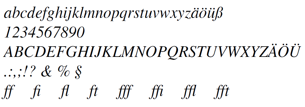
The font Times New Roman or Times Roman is probably one of the best known fonts. Especially in universities, this font is regularly prescribed as the standard font for writing final theses. This is despite the fact that this font was originally developed for a newspaper. It is therefore more suitable for the typesetting of a multi-column document. In my opinion, the most probable reason for using this font instead of another one might be its popularity.
The following statements refer to the Adobe package available through mathptmx package Times Variant and the LaTeX standard font Computer Modern. Except the sharp ß, only minor differences can be observed in the small letters. In the case of capital letters, the difference is even easier to recognize.
Also, the representation of the letters K, Q and R differ very clearly from each other. The presentation of the figures also differs significantly, in particular the 2, 3, 5, 6 and 9 show easily recognizable differences. The amp sign (&) and the percentage sign (%) appear to be more upright in the standard font and are clearly different from their equivalents within the Times variant considered here.
The typeface is includeed via the already mentioned mathptmx package. There is also a times package, but its use is generally not recommended. Because it not only sets the serif font, but also the sans serif font and typewriter font. However, the sans serif font Helvetica is not adapted to Times and no suitable math font is included (see [Schmidt 2004, p.8]). The mathptmx package only adjusts the serif font and provides the appropriate font for math (see [Schmidt 2004, p.5]).
\documentclass[12pt]{article}
\usepackage{mathptmx}
\usepackage[T1]{fontenc}
...
\begin{document}
In the case, that also sans serif and monospaced fonts should be changed too, the corresponding packages for these fonts must also be included. In the following example Helvetica and Courier. For the scaling of Helvetica, the values 0.9 or 0.91 or 0.92 should be tried.
\documentclass[12pt]{article}
\usepackage{mathptmx}
\usepackage[scaled=0.9]{helvet}
\usepackage{courier}
%\usepackage[T1]{fontenc} % only necessary for internationalization
...
\begin{document}
Since, as mentioned earlier, the font was developed for printing newspapers, it is much narrower than, for example, Computer Modern. Depending on the amount of work and the font size set, this can lead to noticeable differences in the number of pages required. In my opinion, this effect should not be overestimated, since the use of the commands \newpage and \chapter, to name just two, can have a much greater influence on the page number. But you should keep these effect in mind.
In the case of a document that does not require mathematics, it is also possible to simply change the serif font to Times, since no mathematics fonts are required.
\renewcommand{\rmdefault}{ptm}
\begin{document}
This works without including an additional package and changes the serif font to Times (ptm).
With XeLaTeX the use of other fonts is much easier. You should only make sure that the file is saved in UTF8 format. Otherwise, there are problems with the representation of the umlauts. The following example shows how to create a document with the font Times New Roman and umlauts.
\documentclass[12pt]{article}
\usepackage{fontspec}
\usepackage{polyglossia}
\setmainlanguage{german}
\setmainfont{Times New Roman}
\begin{document}
...
\end{document}


